Posts

Blog Entry 7 - Project 2 Research Sketches

Image
    The business I chose to do is called duuude surf shop. I have always loved the beach and have always been in love with surfing and surf shops, even though I have never surfed before its always been a dream of mine. All my merchandise with be environmentally friendly and made from recycled materials that are found in the ocean. My whole business idea is based off the stereotypical surfer girl/guy and typically, they always say duuude and have this super calming presence about them, just really chill and cool vibes. Therefore, I tried to best represent that in my designs with what I thought would go along with this idea. That would include a surfboard, waves/beach, and beachy colors. I wanted to create different logos that would look like its very high end/sleek as well as fun and chill.   

Blog Entry 6 - Project 1 Final Refined Submission

Image
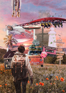
  Changes moved jetski to horizon line added volleyball with gradient/color overlays added "you make me love" sign with gradient/color overlays moved succulent from the top on the van to the top right corner of the polaroid removed the blue glow from the rollercoaster added 3 paint brushes falling from the jar with gradient/color overlays tried to make the field of flowers look like the objects (van, volleyball and jetski) are set inside of it (erased some of the objects to make the flowers show through) erased some of the splatters that were coming off from the cross picture

Blog Entry 5 - Project 1 Critique Submission

Image
  With my project I tried really hard to make sure all the images flow together. I also tried really hard to make sure all the colors flowed together so I used a bunch of gradient and color overlays to make sure not one image is the focal point by being too bright. I tried to make the main focus of my piece surrounded by travel and adventure but also to add little pieces of myself and what's really important to me. I also choose pieces that represent a rustic/vintage aesthetic which is why I went a polaroid film and camera, a mixtape, and a VW van. I also added a texture over my whole piece to really tie in the rustic/homey feel. I also didn't really want any hard edges with my pictures, unless they were cut out, because I feel like they would've been an eyesore. I'm really happy with how this turned out and it really drives to heart what's important to me. This got me to be able to show my passions in a unique and creative way. Its a piece I can show someone and it...

Blog Entry 4 - Project 1 Research

Image
  Viktoria Solidarnyh       One of the reasons I like her artwork is that she shows what the original images are and how she manipulated and composited them together to make a seamless image. The photo above is one of my favorited because it reminds me of the creation story of the sea turtle with the castle on its back. I was drawn to this because I love sea turtles. I also love how each almost each part of the castle was its own separate photo that she combined that flows flawlessly. I think the imagery behind the photo is like there's this explosion going on in the background and the turtle is swimming away from the destruction with the castle on its back saving the only civilization left on earth. There were a bunch of individual pieces that make up the subject in whole especially the castle and its surroundings which I would've believed were just one imagine and not individual imagines composited together.  Levi van Veluw  ...

Blog Entry 3: Out of Bounds Composite Demo

Image
 

Blog Entry 2: Basic Compositing Demo (Meerkats)

Image